
Note: The dashboard doesn't include data from the Career Page survey, the Confirmation Email survey, internal surveys, or Quality of Hire and Onboarding surveys.
1. Start with the Main tab
The Main tab is your homepage for candidate experience. Before diving into filters or drill-downs, spend a few minutes here to get a sense of how things are going overall.
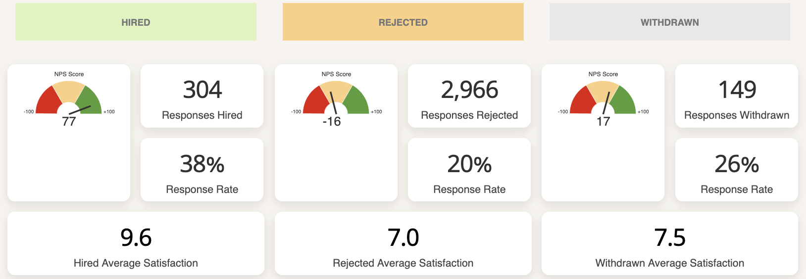
Check your Response Rate first.
A low response rate means your data may not be representative - so before drawing any conclusions from your scores, ask: are enough candidates actually responding?
You can see the overall response rate at the top.

Scroll down to see it broken out by candidate type (rejected, withdrawn, and hired).
If you want to know how you're performing against other companies, make it a point to regularly view the Starred Benchmark. 📘 Learn about the Benchmark →
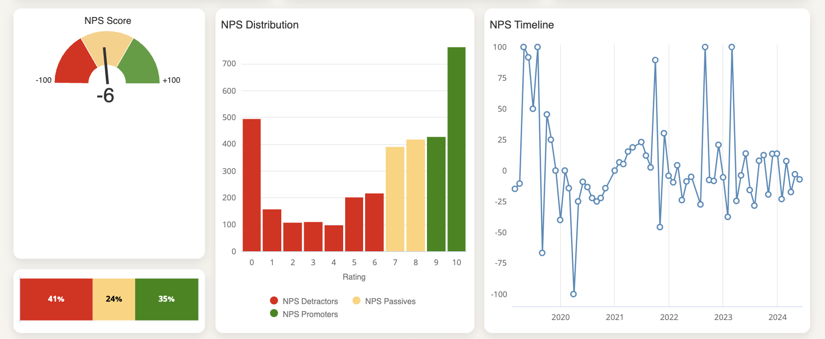
Then look at your NPS.
Your Net Promoter Score tells you how likely candidates are to recommend your process to others. It's one of the fastest ways to gauge overall sentiment.
To dig deeper, click the NPS speedometer chart and select the NPS Drill-down Dashboard - it breaks results down so you can see where positive and negative scores are coming from.
From the first block, you can deep dive into your NPS results:
- Click on the NPS score speed-o-meter chart
- Select the NPS Drill-down Dashboard
-
For a more detailed understanding, scroll down to your high-level stage breakdown and view NPS score per rejected, withdrawn and hired candidates.
If you're not sure whether your numbers are good or bad, check the Starred Benchmark to compare yourself against similar companies. 📘 Learn about the Benchmark →
Review your average scores per subject.
These show how candidates rated specific parts of the process, like communication, interviews, or the feedback they received.
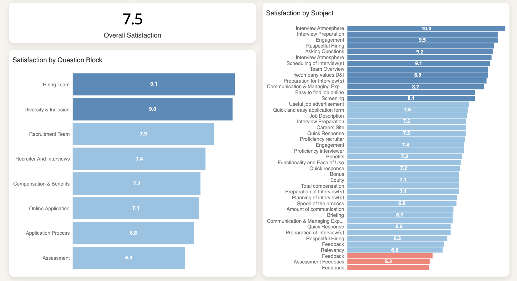
Use these to quickly answer: what's working, and what isn't?
Click any subject tile to open a drill-down with score distributions, trends, and comments.
- Click on the title or the bar
- Select the Drill-down Dashboard
2. Dig into low scores
When something catches your eye in the Main tab - a low score, a sudden drop, a subject that consistently underperforms - that's your signal to investigate.
-
Click the relevant subject or question block to open the drill-down dashboard.
-
From there, you can review the score distribution, see how it trends over time, and read candidate comments that explain the "why" behind the number.
You can also apply filters (for example by department, recruiter, or location) to identify where the issue occurs.
3. Use Performance dashboards to identify patterns across your team
Once you understand your overall results, the Performance dashboards help you see how candidate experience varies across your organization.
- Department Performance - compare results across teams to find which departments are delivering the strongest (and weakest) candidate experiences
- Recruiter Performance - see how individual recruiters are performing and identify where coaching could help
- Coordinator Performance - review feedback specifically related to recruiting coordinators
These views are most useful when you're trying to figure out where to focus, rather than what the problem is. If one department's scores are consistently lower, that's where to start.
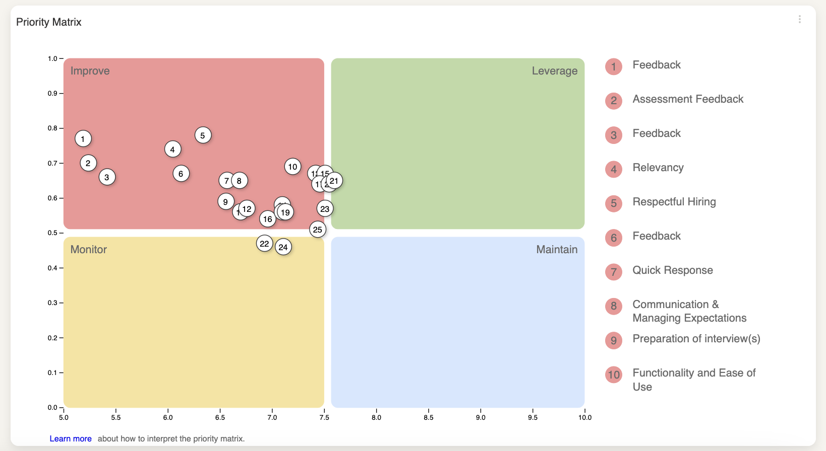
4. Prioritize improvements with the Priority Matrix
It's tempting to focus on your lowest scores, but low scores on less important topics won't move the needle as much as improving something candidates care about deeply.
The Priority Matrix helps you make smarter decisions by mapping which aspects of your process have the most impact on overall candidate experience - and where you're currently underperforming.
Use it when you're deciding where to direct your time and resources.
📘 Learn more about the Matrix →
5. Understand the "why" with Comment Analysis
Scores tell you what's happening. Comments tell you why. The Comment Analysis dashboard makes it practical to work with large volumes of qualitative feedback.
Start with the Sentiment Score.
This gives you a single metric - similar to NPS - that summarizes whether your candidate comments skew positive or negative. It's calculated as:
(Positive comments − Negative comments) ÷ Total comments
The result lands between -100 and +100.

The Sentiment Distribution chart breaks this down further, showing the proportion of positive, neutral, and negative comments.

Then look at topics.
Each comment is automatically tagged with a topic using machine learning, so you don't have to read through everything manually. Common topics include:
-
Process – the application or interview process
-
Communication – scheduling, updates, or information shared
-
Feedback – explanations provided to candidates
-
Recruitment Team – interactions with recruiters or interviewers
-
Company – company culture, brand, or values
-
Salary and Benefits – compensation or perks
-
Speed – how long the process took
-
Preparation and Assignment – tests or interview preparation
-
Onboarding – the onboarding experience
-
DE&I – diversity, equity, and inclusion topics
The Topic Distribution chart shows which topics come up most often.

Combine sentiment and topics for the sharpest insights.
The Sentiment per Topic view is where things get really useful. It shows whether feedback on each topic is mostly positive or negative.

You might find candidates love your recruitment team but are frustrated with how long the process takes - that's a specific, targeted finding you can act on.
Finally, read the actual comments.
At the bottom of the dashboard, you can scroll through individual responses with their sentiment and topic labels.
This is useful for validating the automated analysis, understanding context, and pulling concrete examples to share with your team.

Using Comment Analysis regularly helps turn large amounts of qualitative feedback into clear insights you can act on.
What's next
Once you've explored your own data, the next step is understanding how your results compare to other organizations.
The Starred Benchmark lets you compare your NPS, response rates, and subject scores against a dataset of similar companies - so you can set realistic goals and understand where you're genuinely ahead or behind.
📘 Learn about the Starred Benchmark →