
The Performance dashboards give a quick, actionable overview of survey results for Departments, Recruiters and Coordinators, helping you compare teams, roles, or groups and identify trends.
Before you start: These dashboards only appear if you've set up Department, Recruiter, and Coordinator as custom fields in your candidate responses, and have assigned them to the reserved Starred fields with the field type set to "recommended."
If your dashboards aren't showing up, that's the most likely reason. Reach out to support@starred.com if you need help getting this configured.
Note: These dashboards don't include data from the Career Page survey, the Confirmation Email (Candidate Applied) survey, internal surveys, or Quality of Hire and Onboarding surveys.
Reading the overview metrics
At the top of each Performance dashboard, you'll see three headline numbers:
- Total responses - how many candidates submitted feedback. This matters because small sample sizes can make scores look dramatically better or worse than they really are. A recruiter with a 72 NPS based on 6 responses is very different from one with a 72 NPS based on 200.
-
Average rating - the mean score across all star and grade questions in the survey. Think of this as a general quality signal: it smooths out variation across individual questions to give you a single number to compare across teams.
-
NPS Score - Net Promoter Score, which measures how likely candidates are to recommend your recruitment process. It runs from -100 to +100, and is calculated by subtracting the percentage of detractors (scores 0-6) from the percentage of promoters (scores 9-10). Anything above 0 is net positive; above 50 is considered strong.
Below these headline numbers, the same three metrics are broken down by each department, recruiter, or coordinator. This is where the dashboard becomes useful for comparison - you're not just seeing the average, you're seeing who's above it and who's below.
Specific insights
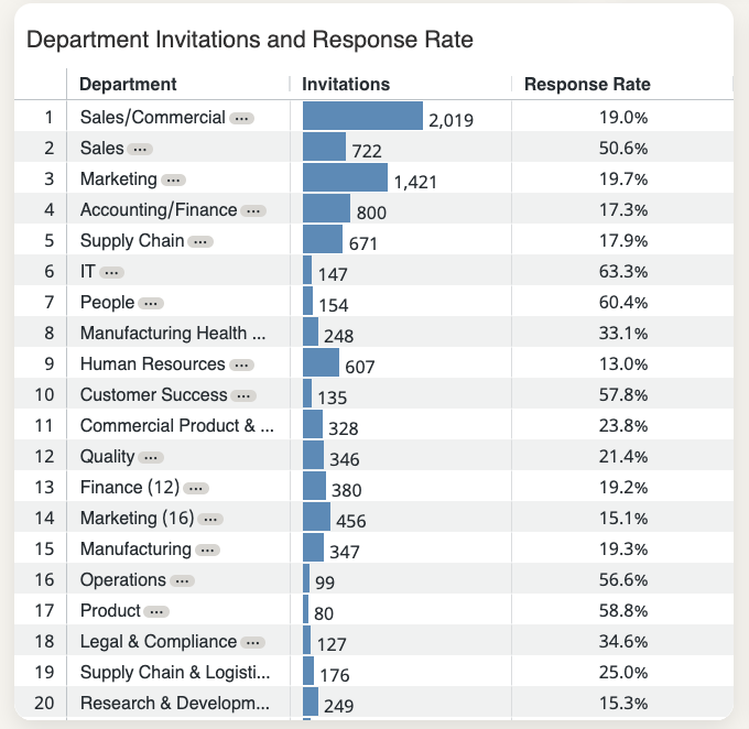
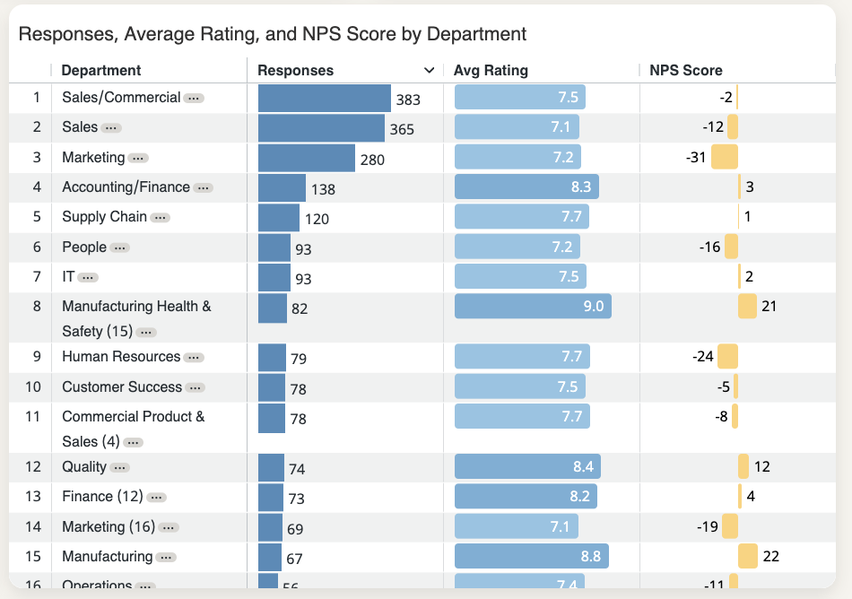
Responses, average rating, and NPS per entry
This table gives you a row-by-row view of every department, recruiter, or coordinator in your data.
Scan it to quickly identify outliers - who has unusually high or low scores, and whether their response count is large enough to take seriously.
A recruiter with a low average rating and high response count is a clearer signal than one with a low average rating and three responses. Always read the numbers together.
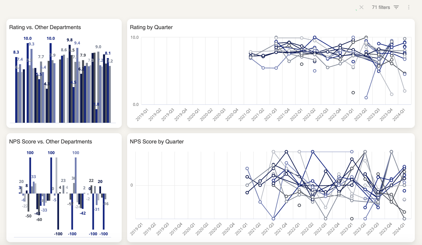
Heatmap
The heatmap is often the fastest way to spot patterns. Rather than reading through individual scores, it uses color to show performance across subjects - typically on a scale from red (low) to green (high) - so your eye naturally jumps to problem areas.
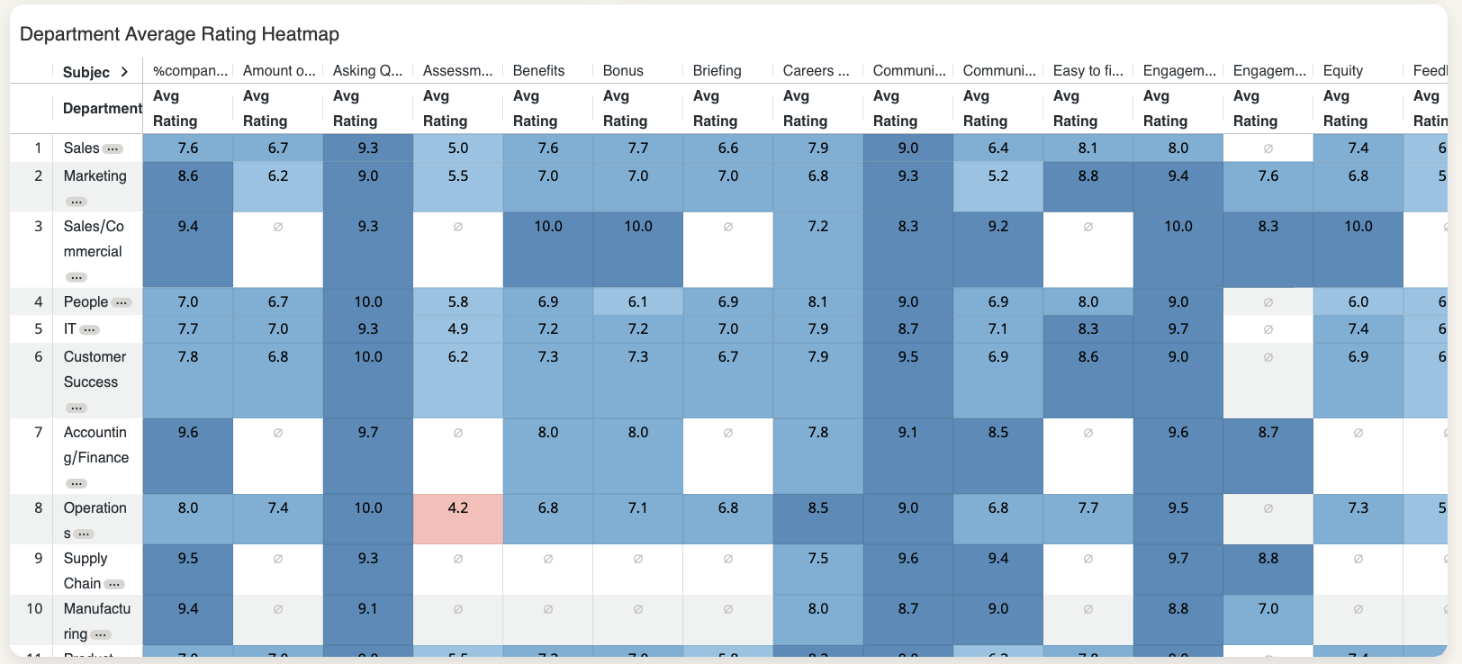
Use it to answer questions like: Is a low Communication score a company-wide issue, or is it concentrated in one department? If one column is consistently red across multiple teams, that suggests a systemic problem. If one row stands out, the issue may be specific to that recruiter or department.
Drilling deeper
When the overview raises a question - a department with a surprisingly low NPS, a recruiter whose heatmap row is mostly red - the drill-down views let you investigate without switching dashboards.
Deepdive
Click the three dots next to any department, recruiter, or coordinator name and select Deepdive.
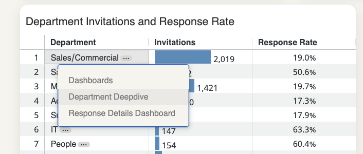
This opens a detailed view that includes:
- Comparison against overall results - so you can see not just the absolute score, but whether this team is above or below your company average for each subject. A score of 7/10 looks different if your company average is 6 versus if it's 8.5.
- Trends over time - useful for understanding whether things are improving, declining, or holding steady. A low score that's been trending upward is a different situation than one that's been flat for six months.
- Ratings and scores by subject - broken down the same way as the main dashboard, but filtered to this specific team or individual.
- Candidate comments - the qualitative context behind the numbers. If you don't have this permission, you'll see a notice in place of the comment text.
Note: Comments are only visible if your role has the “Can view comments” permission. Otherwise, a notice will appear instead of the comment text.
Reading the Deepdive alongside the heatmap is usually the most efficient workflow: use the heatmap to spot what needs attention, then use the Deepdive to understand why.
Response details dashboard
Click the three dots → Response Details Dashboard to see the individual responses linked to a department, recruiter, or coordinator, along with the custom field data attached to each one.
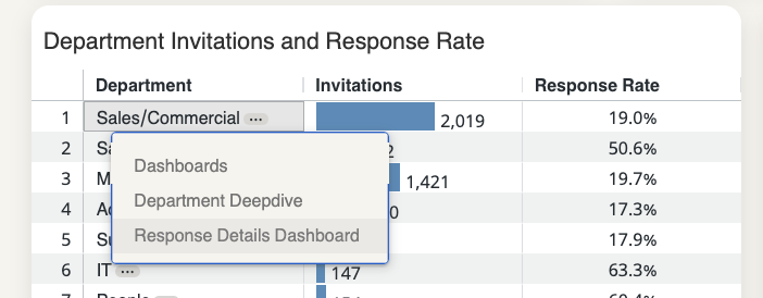
This is most useful when you want to go beyond aggregated scores - for example, to check whether a pattern holds across different office locations within one department, or to pull specific responses to share with a manager.